|
|
Wizard Oil by Carol Pinchefsky |
November 2005
British and American Cover Art:
How and why they're different
What I don't know about art can fill a book entitled, "I don't know if it's art, but I know what I
like." But on a recent trip to England, even I, the artistically challenged, noticed that British and
American cover art was decidedly different: American book covers were more colorful, almost
garish, while British book covers were more austere and muted. Big empty swathes of negative
space filled the British covers, and they looked practically empty next to their busy American
counterparts.
Why the difference?
As we all know, people aren't supposed to judge a book by its cover. However, the marketing
departments of all major publishers are bent towards the opposite assumption: cover art entices a
book-store browser to reach for the book, to wonder what lies within its pages, and ultimately, to
spend money to find out the answer. Culture influences design, and as America and the United
Kingdom are two vast nations separated by a common language, cover art obviously reflects this.
Because art is so fluid, because the market changes from decade to decade, and because there are
no hard and fast rules, it is all but impossible to summarize the difference between the two. Or is
it?
Rita Frangie, an assistant art director at Penguin Books, says she does not want to generalize.
However, "Here [in the United States] we tend to want to use every inch, to fill [the cover] up
with color, and to get it to do as much as it can do. Everything here is bigger, more commercial,
more targeted to sell and to advertise. In Europe, the covers are geared to look more like the way
they dress: very simple. Their use of negative space goes along with the theory of less is more."
British artist David A. Hardy says, "I think American art tends to be realistic, sharp, and colorful,"
while American artist David Cherry says he would treat a British cover "more as a piece of fine
art rather than a piece of advertising." On the other side of that coin, American art has been
criticized as being too commercial; British art, too stark.
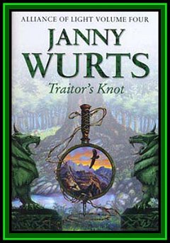
According to my British husband, the Brits have a tradition of landscape paintings, stemming
from the mid-19th century and heralded by John Constable. American artist Janny Wurts, the
novelist/artist who paints her own book covers, follows this tradition in her British covers; her
American covers suit the American tastes. A reader sees the difference instantly with her book
Traitor's Knot.
 |
 |
United Kingdom: HarperCollins, Voyager.
Copyright © Janny Wurts |
United States: Meisha Merlin.
Copyright © Janny Wurts |
The British cover is a lush composite of three paintings (see Wurts' originals here) In the American cover, a handsome man lounges in a richly furnished library. His looks
away from the book he has open on his lap.
Darren Nash, an editor with British publisher, Orbit Books, "British readers prefer to image their
own characters and don't want [preconceived] impressions in their mind." He believes "you can't
create atmosphere with people, but you can with landscapes."
Americans prefer characters with whom they can identify, perhaps stemming from a very
American tradition of emotional expression and sympathy (or as my husband would say, touchy-feelyness). The characters displayed on American art depict either characters in the book or a
situation from the book.
But what is true for fantasy does not necessarily apply to science fiction, as seen in Larry Niven's
Ringworld's Children.
 |
 |
| United Kingdom: Orbit |
United States: Tor |
According to Hardy, American "science fiction cover art tends toward using fairly realistic
hardware." He and American artist Bob Eggleton attribute NASA as an influence on that realism.
Eggleton says, "The hardware looks as if it could fly and really work. In England, [artists] use
wild shapes, strange fins, antennae�and phalanges. It's very imaginative." Great Britain did not
have NASA, but it did have H.G. Wells.
The American cover does indeed display the markings of realism: the Ringworld looks like a
man-made construct, albeit a far-flung one. In the British cover, a ring surrounds a nebula while a
thin ship emits a burst of bright exhaust--but neither Ringworld nor children are seen.
Of course, for every example, there is a counterexample, such as the Stephen Donaldson covers
for Runes of the Earth below:
 |
 |
| United Kingdom: Gollancz |
United States: Putnam Adult |
In the Stephen Donaldson books, the American cover is very much a traditional British
landscape. However, it the use of bright color makes it obviously American. The British cover is
black and white--even more colorless next to the American one.
Nash says that British books "try more to evoke a mood and an atmosphere rather than illustrate
a scene from the book," And nothing illustrates this statement more than the cover of Runes of
the Earth. The mood it creates, however, is bleak. Does a forlorn cover successfully capture the
mood of his book? Author Stephen Donaldson thinks so.
But rather than merely suggest a mood, does this cover also capture a trend? The minimalist,
black and white cover was used successfully yet differently in both editions of Susanna Clarke's
book, Jonathan Strange and Mr. Norrell.
 |
 |
| United Kingdom: Bloomsbury |
United States: Bloomsbury USA |
The covers are the same picture with reversed colors. Frangie says, "We repackage books to
make them suitable for the market that we're targeting. But sometimes the publisher that buys
[the book] is pleased with the cover and keep[s] it, or there's a look for that author that they want
to maintain."
In this cover, the complex and secret history of British magic is boiled down to a simple
silhouette. Wurts says, "The idea of a bookcover is to provoke thought. Sometimes showing less
provokes more thought and makes people ask more questions. You're [reducing] the idea of the
book down to a symbol and making that symbol represent the book."
Frangie says, "British covers have more of an overall simplicity, but not simple as in lacking in
something needed."
But is it art?
Actually, according to artists, no. The Susanna Clarke covers, like both of the covers for Charles
Stross book, Accelerando, are considered a graphic. For example:
 |
 |
| United Kingdom: Orbit Books |
United States: Ace Books |
Although the styles are very different, the similarity remains: both covers are graphics, that is,
layered images that have an emphasis on type, shape, and strong color.*
Following an American tradition, the American cover depicts strong color. Saturn is in the
background, its rings reach out but are covered by blocky shapes. The image fades, top down,
into white, and the color within the squares pops out.
The British cover is distressed, with Jackson Pollack-like splashes on top of the image. Even
though it features a character, he is in a non-traditional pose, with his back toward the reader.
The background features a very strong texture, perhaps to contrast the lack of color.
Both covers display almost no relationship between the cover and the content. Although the book
takes place, in part, on Saturn, Saturn is deliberately obscured in the American edition; Stross
says the cover displays "echoes of an exponential curve, as echoed by the patterns of blocks," but
a mere bookstore browser would have no way of knowing that. The British edition conveys a
sense of intrigue--who is this man, and why is he looking away from us--but the film noir style
is more suited to the mystery genre rather than science fiction.
Although the cover of his upcoming book, The Atrocity Archives, is part of the American
tradition of representational painting, Stross says there's a reason for using graphics rather than
an artist. "Representational art means paying an artist."
But Nash tells of a different reason to use graphics rather than paintings, as best displayed in the
British and American versions of Robert Jordan's Knife of Dreams:
 |
 |
| United Kingdom: Orbit Books |
United States: Tor Books |
Nash says, "One of the things we're finding is that many of our readers don't consider
themselves fantasy readers: they like a good story and fantasy certainly gives that. I do like a lot
of science fiction and fantasy art, but some of it is best appreciated by people steeped in science
fiction and fantasy. It doesn't persuade someone teetering on the edge to read this book. I see
using graphics as removing any preconceptions and impediments to customers buying the
books."
And it certainly has worked. In the four years since Orbit has used the graphic covers for the
Robert Jordan books, Nash says, "sales have seen an uplift--to use a David Brin phrase--of a
third."
Both American artist Bob Eggleton and British artist David A. Hardy say they could tell which book
cover was American and which was British from across a room. And after only a short study, so
can I.
David Cherry, former president of ASFA (Association of Science Fiction & Fantasy Artists)
believes the real reason why British and American cover art differs is "different editors are
making different decisions. [British editors] found artists they like to work with that they use a
lot, and our publishers work with people over here who have other strengths."
Eggleton says that cover art follows trends, and styles will always change. Wraparound covers
are out--Eggleton says publishers won't dig into their pockets as deeply as before--and graphics
are in. He believes that the trend, like all trends, won't last: "What goes around comes around."
Wurts concurs.
Like all things, change in cover art style is inevitable in both countries. As long as people buy
books, marketers will anticipate the next trend and package appropriately. British and American
covers will follow their own rules and break them at will.
Whether the cover art is "good" is a not just a matter of personal taste. British editor Darren Nash
says, "The primary job of a cover is to sell the book so, by definition, a cover that results in high
sales is a good cover--even if the quality of the actual art underlying the design is less than
brilliant. Likewise, an absolutely beautiful piece of art that faithfully reproduces a scene from the
book, but doesn't result in the book being bought, is a bad cover."
So what do the artists prefer? Do they like the sweeping vistas of the traditional British
landscape, or the personal connection of the American portrait? American artist Don Maitz knows which
one he likes best: "American publishers pay more," he says.
For a good way to compare American and British art, open two windows in your web browser,
one for www.amazon.com and www.amazon.co.uk, and search for your favorite authors. You
may be surprised by what you see.
* Thanks to Kris Dikeman for definition.