|
|
Miracle Pictographs
|
January 2013
Walk 'Round Middle-Earth, To Work Thy Middle Girth.
The Hobbit: Illustrated By David Wenzel, Adapted By Chuck Dixon (Del Rey 1990), The
Martian Chronicles
If you've seen The Hobbit, which you all have, your next step is a good pee, because man that
was a long movie.
The next step after that is to complain on the Internet that holy crap that was padded out.
The next step after that is to reread the book, or check out the graphic novel adaptation. And
such an adaptation it is, blessed with gorgeous, rich watercolors by David Wenzel, a fantasy
artist without compare.
It's hard to detach Middle-Earth visually from the world created by John Howe and Alan Lee,
the artists who inspired and supervised Peter Jackson's design. But if you can, perhaps, put
yourself in the mindset of one first visualizing the world of The Hobbit, Wenzel's art is a dream
come true.
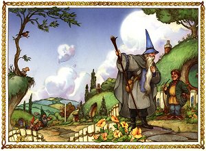
Bilbo's world is alive with washes of red and green and blue; hobbit-cheeks are rosy and little
hairy feet trod the rocks of Middle-Earth. Gandalf's bushy eyebrows bristle from under his
voluminous blue hat, and his beard seems alive. Grotesquely faced goblins, their lips hanging
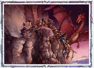
like Dali's clocks, babble about the evil of dwarves. Beorn is a roaring beast towering out of the
madness of the Battle of Five Armies.
I personally loved Bilbo in the comic. He's rounder, homelier and hairier than Martin Freeman,
and though I wouldn't replace Freeman, it is nice to have the little fat Hobbit tummy Tolkien
described.
At other times one wishes Wenzel had Jackson's visual resources -- the Elves look like a bunch
of generic medieval townspeople, indistinguishable from the men and women of Lake-town. But
there's very little to complain about with the art.
Except for one more thing: you can't see enough of it, because there are too many words on each
page!
It's a peculiar fact of life that The Hobbit's comic-book adaptation suffers from the exact
opposite problem that the film has. Peter Jackson made the mistake of padding out a well-paced
story without really adding in well-paced action sequences of his own. An hour for Bilbo to
decide to leave his house. Another hour to get to Goblin-Town. This when the Council of Elrond
sequence in Fellowship was a measly four minutes! Jackson has shown that he knows how to
pace a story.
This comic, in contrast, squeezes absolutely everything into its meager page count. Chuck
Dixon, the writer, festoons each page with Tolkien's admittedly flowery prose. So much so that
this isn't so much a graphic novel adaptation as it is another illustrated edition of The Hobbit.
That's fine -- I own and like both illustrated editions by Michael Hague and Alan Lee,
respectively, and could always use more -- but the text here, typical comic-book text, is tiny!
And everywhere!
We can get Bilbo decompressed on film or squeezed into a tiny comic, but we can't get the
pacing right from Tolkien's simple, straightforward quest!
Too many words on a page makes for a difficult comic for kids, in this case, the target audience
of The Hobbit, to read. Comic books are good for young readers because they often have high
vocabulary levels (notice how Calvin and Hobbes used words like "anthropomorphize" and
"oblique aspersions") with a low level of words on the page, and an easy-to-contextualize visual
layout.
But with a ton of words on the page, crammed into tiny panels, with things happening in said
tiny panels, which compare to about 9 point font . . . it makes The Hobbit actually harder to read.
Don't let it stop you, folks. But perhaps you might reflect, with me, that the adaptation of The
Hobbit which best nailed pacing and characterization was the creepily fun Rankin-Bass animated
adaptation.
(One cannot help wondering, after seeing this adaptation of The Hobbit, if a Lord of the Rings
comic series might be in the works. Longtime Pictographers know this is on my wish list. It
would have to be given lots of room -- you can't cover more than two Tolkien chapters, really,
per 48-page issue. I've always thought that P. Craig Russell was born for this project. Carlos
Pacheco could probably nail it as well, going by his work on the series Arrowsmith. There are a
lot of artists who could go very wrong on it, so we would need a careful, thoughtful artist willing
to put in the same obsessive detail Jackson did. We would also need a writer like Peter David on
The Dark Tower comics, able to bring humanity to the original language.
To whomever in the industry may be listening: do it! And get it right!)
On the other hand, The Martian Chronicles almost captures Bradbury's vision perfectly. We all
read The Martian Chronicles in junior high. I suspect that if you didn't, you are a Martian
yourself.
The book is lyrical, deep, a poetic ode to all that is unknown and alien in the human spirit:
infidelity, madness, grief, time's tricks and the disconnect between modern life, built over
indigenous people's tragedies and ghosts.
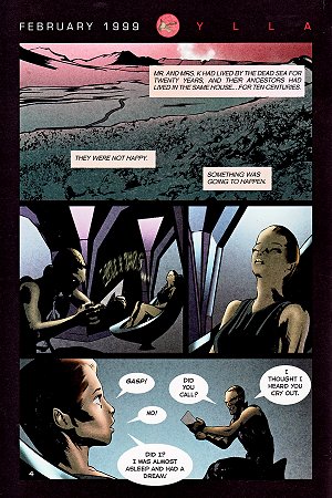
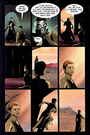
Dennis Calero's art is almost a perfect match. It takes a photorealistic style and drenches it in
deep, dark contrast, making the world one of half-light, a red wash, and deep black. A particular
effective sequence is in the story "The Off-Season" where a Martian swims out of the air, white
bits of hair trailing behind its head, to confront an arrogant human.
The only issue is that Calero's art is often claustrophobic. There are a lot of claustrophobic,
paranoid moments in Bradbury's book, so this is often good. "The Martian" takes us to the house
of a couple who have lost their son and have him replaced by a Martian, whose latent telepathy
causes him to appear as a different lost loved one to each human. This story, full of facial close-ups, ending on a horrendous moment when the Martian collapses in a puddle of faces, is
perfectly suited to the art.
In other places, though, we need a lot more room. ". . . And The Moon Be Still As Bright"
follows the steadily deteriorating madness of a crew member on an exploratory ship, as he
explores the Martian ruins and becomes convinced he must kill his crewmates to keep the place
sanctified.
The comic is mostly head shots, even though there is a great deal of talk about the Martian vistas
and Martian cities, and Bradbury's prose relies on the Martian landscape being a character. This
particular story needs more vistas.
It's a minor complaint, though. This is really a great adaptation of Bradbury's work. The art has
its own poetry.
Next issue: The Incredible Changing Robots are back! Yes, it's time to take the pulse of
Transformers comics, and see if anything can redeem us from the curse of Michael Bay.
Read more by Spencer Ellsworth